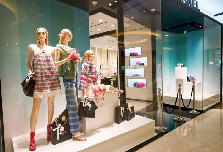
When it comes to drawing shoppers into your store, your signage is often the first impression they get. On a bustling high street, where every shop competes for attention, a creative and unique sign can make all the difference. Let’s explore how you can elevate your store’s visibility and entice customers with innovative signage that truly stands out.
Make It Interactive
Why settle for static when you can have dynamic? Interactive signs are becoming a hit with shoppers who love a touch of novelty. Think about digital screens that showcase rotating collections or a QR code leading to a surprise discount. Another great idea is a motion-triggered display that lights up or changes as someone walks past. These small gestures can pique curiosity and encourage people to step inside.
Embrace Dimensional Design
Flat, two-dimensional signs are easy to overlook. Add depth and creativity by using three-dimensional elements like raised lettering, layered textures, or even props that tie into your products.
For instance, a fashion boutique could integrate miniature mannequins or hanging accessories into its signage. Materials such as frames are perfect for this purpose because they’re lightweight yet durable, giving you flexibility in your design. For high-quality options, check out foamex at Simply Plastics to explore versatile materials for your signage needs.
Play with Colour and Contrast
The psychology of color plays a massive role in attracting attention. Bold hues paired with high contrast can make your sign pop, even from a distance. For a fashion store, use shades that resonate with your brand identity while considering the preferences of your target audience. Neon accents, for instance, can evoke a trendy vibe, while earthy tones might appeal to those seeking sustainable fashion.
Incorporate Lighting for Night Appeal
A beautifully lit sign can turn your store into a beacon during evening shopping hours. From soft, warm glows to vibrant LED animations, lighting can be tailored to match your brand’s personality. Backlit letters, for example, create a sleek and modern appearance, while marquee-style bulbs add a retro touch. Don’t just think of lighting as functional—let it tell a story about your brand.
Prioritise Readability
No matter how creative your design is, your message must be clear. Fonts that are overly intricate can make your sign hard to read, especially from a distance. Stick to legible typefaces and ensure your text stands out against the background. Remember, clarity always trumps complexity when it comes to communication.
Experiment with Unusual Shapes
Break away from the traditional rectangular signs and experiment with unique silhouettes. A sign shaped like a handbag or a dress, for example, immediately signals what your store is about. Shoppers will appreciate the originality, and it makes your store easier to remember.
Conclusion
Your signage is more than just a way to display your store’s name—it’s an invitation and a reflection of your brand. By combining creativity with practicality, you can make your shop an unmissable feature on the high street. With thoughtful design and innovative ideas, your fashion store can shine brightly in even the busiest of locations.


