Art is all about having fun, being creative, and expressing yourself. However, making good artwork can be frustrating, especially for beginners, as they don’t have a solid grasp of the fundamentals.
In this post, I highlight the different types of variety and how you can employ good design elements to add variety in art.
What Is Variety in Art?
Variety refers to using diverse elements and techniques in your artwork to add visual appeal. Whether it’s line quality, colors, or shape language, putting little twists to your design elements creates a dynamic feel to your art.
Let’s see how you can achieve that.
1. Shape Variety
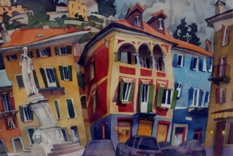
Shape language is the bread and butter of good design. It refers to using different, very specific shapes to express an idea.
While, at first glance, it might seem like a simple idea, you’d be surprised how far it can take your art. If you look at Rudolf Stussi’s city paintings, you’ll see how wobbly and disfigured his buildings look.
That’s a conscious design choice Stussi has taken to make his pieces more dynamic. When you’re drawing, think about how shapes contribute to storytelling.
Have you watched Disney’s Up? The designers of Mr. Fredrickson stretched his design language, drawing him using only squares. That’s not how people look in real life, but it works perfectly to reflect the monotony of his life after his wife’s death.

In contrast with Carl’s squarish life, Russell’s circular design reflects energy and optimism, foreshadowing the change he brings into Carl’s life.
You can see how the variation between both characters’ shape language makes for compelling storytelling.
2. Size Variety
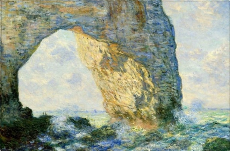
Symmetry is the Achilles heel of shape language. Not only does diversifying the size of your shapes make your pieces more interesting, but it can also express hierarchy and character.
You’ll understand what I mean when you look at Claude Monet’s “Arch to the West From Etretat.” Besides having incredible colors, you’ll note that the arch takes most of the canvas, signifying that it’s the focal point.
Monet didn’t stop there, though. He also diversifies the size of the rocks on the beach to break the monotony of same-size shapes. Let’s look at a more simple example. If you’ve been on the internet for any period of time, you’ve probably heard of Megamind.
The designers of Megamind followed a similar approach to Monet, drawing him with a slim body and a big head to emphasize his astonishing intellect. On the other hand, his arch nemesis, Metro Man, is depicted as a buff superhero.

The juxtaposition between the two characters makes for interesting visuals and expresses the dynamics between them.
3. Line Variety
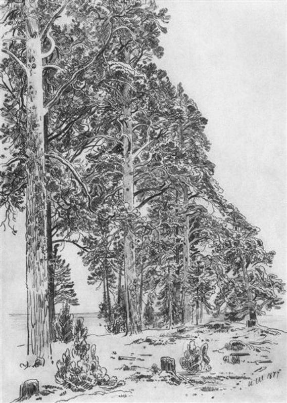
I know what you’re thinking: Lines are just lines! How diverse can they be? Well, buckle up!
Lines can be thin, thick, straight, curved, long, or short. Not only does varying your line weight create visual interest, but it can also accentuate specific elements in your piece.
An object drawn with thicker lines is usually more attention-grabbing than that drawn with thin lines. You can even vary line thickness to indicate where your light is coming from, as thin lines usually face the light source.
If you’re drawing a detailed object, use thick lines for the contour and thin lines for the details. Using the same line thickness will make it look stiff.
In Ivan Shishken’s “Pines on the Beach,” you can see how he uses straight lines for the tree trunks and curved lines for the branches to create balance.
This balance is further emphasized by the jagged lines on the ground, indicating the texture of the grass. Using minimal lines for grass establishes the hosting environment of the piece while keeping the trees the focal point.
4. Edge Variety
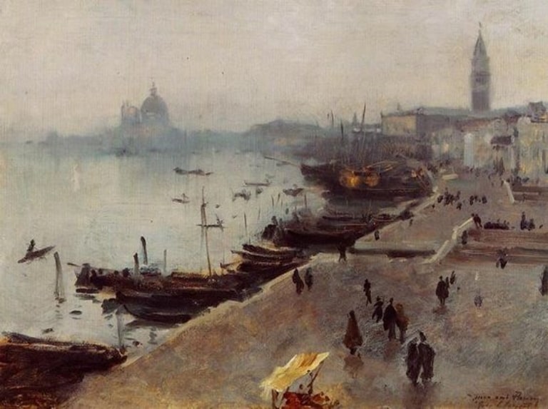
Edges refer to the transition between two elements. Yes, they’re different from lines. You can create dark thick lines with soft and hard edges.
Painting only with hard edges makes your pieces look stiff. On the other hand, soft edges make your art look blurry and distracting.
Try to balance both out. If you look at John Sargent’s “Venice in the Fog,” you’ll see that he used hard edges to establish the setting of the piece and soft edges to set the foggy atmosphere.
Like lines, diversifying your edges can indicate hierarchy. If you look at Zhaowming Wu’s “Lingering Charm,” you’ll see that he uses soft, indiscrete edges throughout most of the painting, except for the arm and face of the lady.
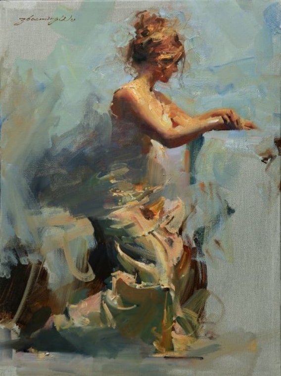
Yes, Wu does this intentionally to pull the viewers’ attention to that focal point. You can also diversify your edges to indicate depth and space. When painting landscape, atmospheric perspective dictates that faraway objects have soft edges.
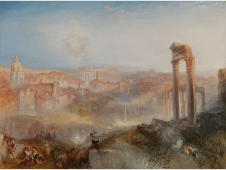
The further an object is, the softer its edges are. Take a look at Jacob Turner’s “Modern Rome – Campo Vaccino.” You’ll see that the city loses its distinct edges as you go further in the piece until it almost blends with the sky.
5. Color Variety
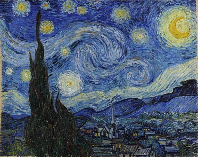
When you’re coloring your piece, verify your usage of hue, value, and saturation. Combine different tints of different colors to create appealing palettes. The most popular way of creating visual interest is by using complementary colors.
These are colors that stand on opposite sides of the color wheel. Have you ever wondered why the crescent moon in Van Gogh’s “ The Starry Night” grabs your attention right away?
That’s because the saturated dark yellow and the blue sky offer an appealing contrast that makes the moon pop out.
When painting/coloring a scene, diversify the saturation and value of your colors to identify the foreground, midground, and background. In other words, the objects closest and furthest from the viewer.
Use dark colors for the elements closest to the viewers, and light colors for the faraway objects. It’s a simple technique, but it adds depth and makes for an interesting composition.
6. Space Variety
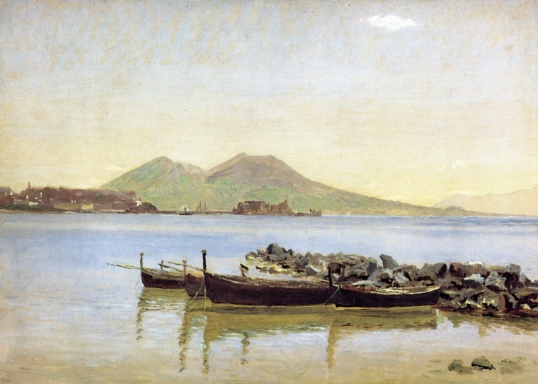
Space variation refers to the ratio between positive and negative space. In other words, it’s about where to add details and where to leave your canvas empty.
It might seem like a strange concept for beginner artists, as their first instinct is usually to make complex pieces with many details.
However, leaving some empty spaces in your pieces can give room for your viewers’ eyes to flow through the illustration. Remember, too many details can be off-putting.
Some professionals advise new artists to follow the 30/70 method, where 30% of the illustration is busy, while the other 70% has fewer details. Some might like it the other way around. So find what works for you.
7. Texture Variety
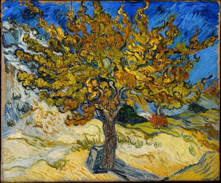
Not only does varying your pen strokes or brushwork help you produce a realistic painting, but it also adds a dynamic feel to your pieces. If you’re using pens, you can combine different rendering methods, like tones, hatching, and crosshatching.
The same thing goes for painting. You can vary the length and direction of your brush strokes to create interesting textures.
Here’s the interesting part: The best way to create diverse textures is to use different materials in one piece. You can combine inks and watercolors, colored pencils and gouache, or pencils and charcoal.
Wrapping Up
So, now you understand that there isn’t one way to add variety in art. After all, various elements and techniques go into making an artwork.
You can use different shapes to tell a story, complementary colors to create contrast, and some texture to paint a more visually-appealing image.


